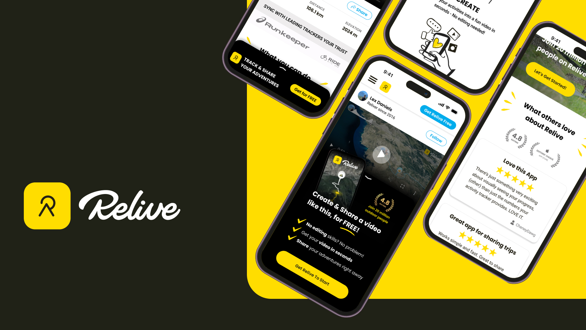
Improving the Video Page to Sign-up Rate
Role : Research + Product Design + Prototype + UI Design
Relive is an app dedicated to outdoor activities and motivating people to get out there. Besides helping active people to track their activities within the app and stay connected with their friends, Relive offers a 3D animated video of each activity which is worth sharing and key element of marketing loop in their Growth engine.

Problem Discovery
Many users who view a shared Relive 3D video may bounce from the page without further engagement. The goal is to identify and address user pain points on this page, ensuring that first-time visitors understand Relive’s value and are motivated to join. This would support Relive’s growth loop by turning viewers into active users.
In other words, the end goal is to increase the conversion rate of visitors landing on a Relive video page, encouraging them to sign up or download the app.
Benchmarking
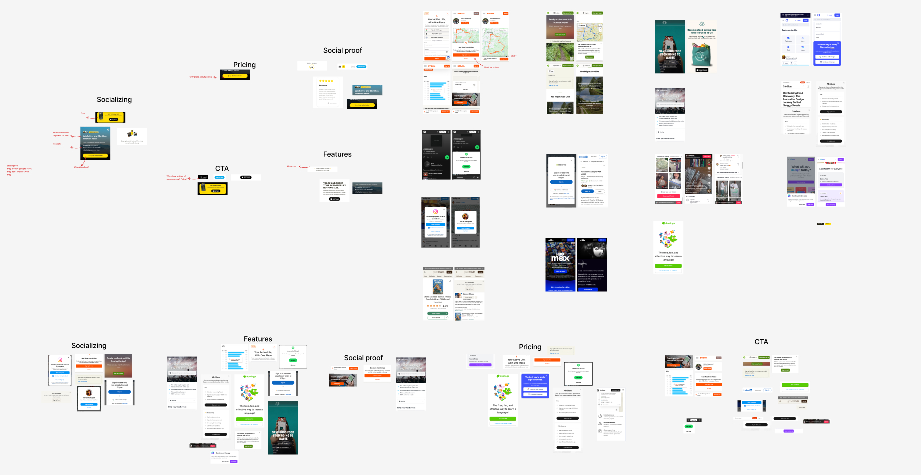
I did a broad research on both direct and indirect competitors to have a overview of their strength and weaknesses in the same scenario. I clustered their CTAs and pop up into these categories:
- 1. Emphasise on socialising
- 2. Value of app (features)
- 3. Social proof
- 4. Pricing
Then I did the same study with Relive’s current approach to find room for improvement and learn from the good studies in it.
User Persona
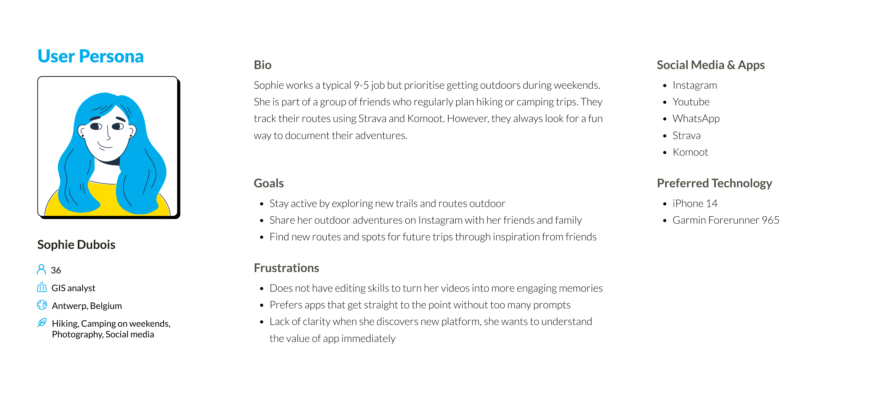
In this case study, the assumptions were:
- 1. The users in this scenario are middle aged (late 30s,40s) outdoor lovers.
- 2. They have never heard of Relive and have limited context of the page they have landed on.
- 3. They have never seen a Relive 3D video before.
- 4. They will watch the video and leave the page.
- 5. They have no idea how big Relive community is.
- 6. Most users view the video page on Mobile device.
Based on these information, I created a representive Persona to help me focus on the User journey
User Journey
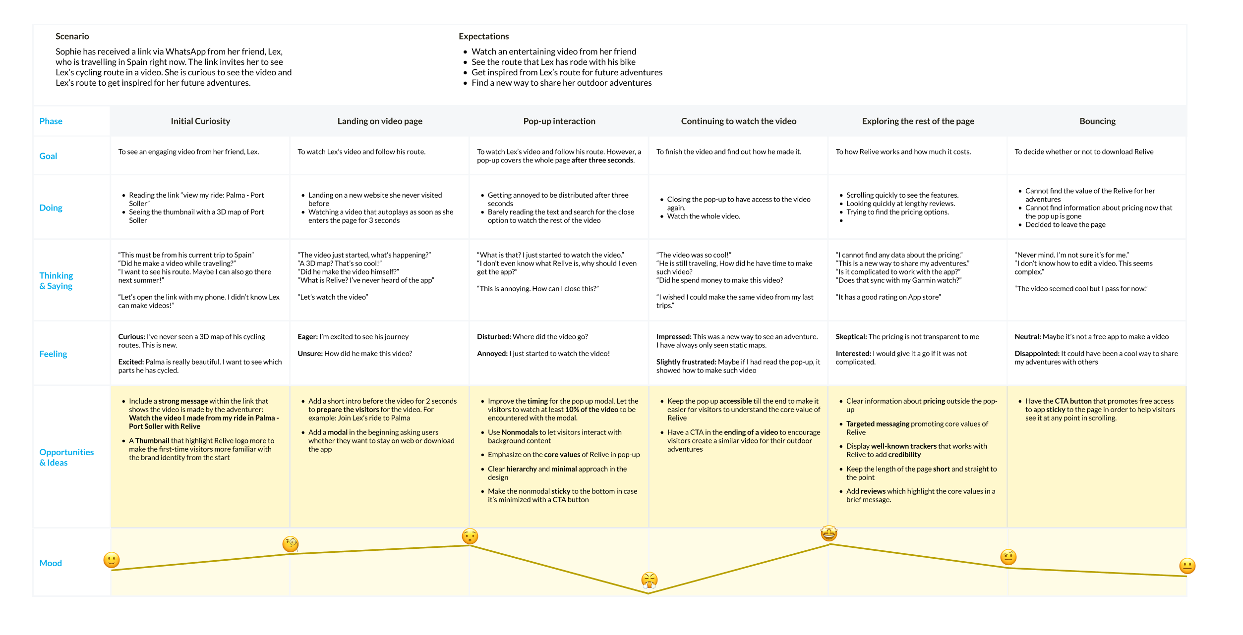
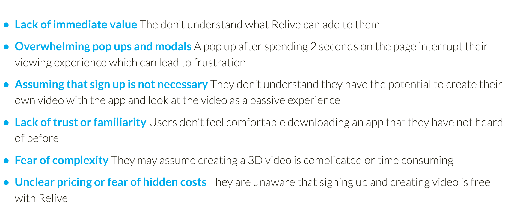
Based on my research and the user journey، user may bounce from the web page after finishing the video without attempting to sign up or download the app from any of these reasons:
A/B Testing
For the first iteration, I would consider conducting A/B testing and Card sorting to see if this approach is the right solution to Relive . These activation metrics help us to measure the success of this solution:

Design
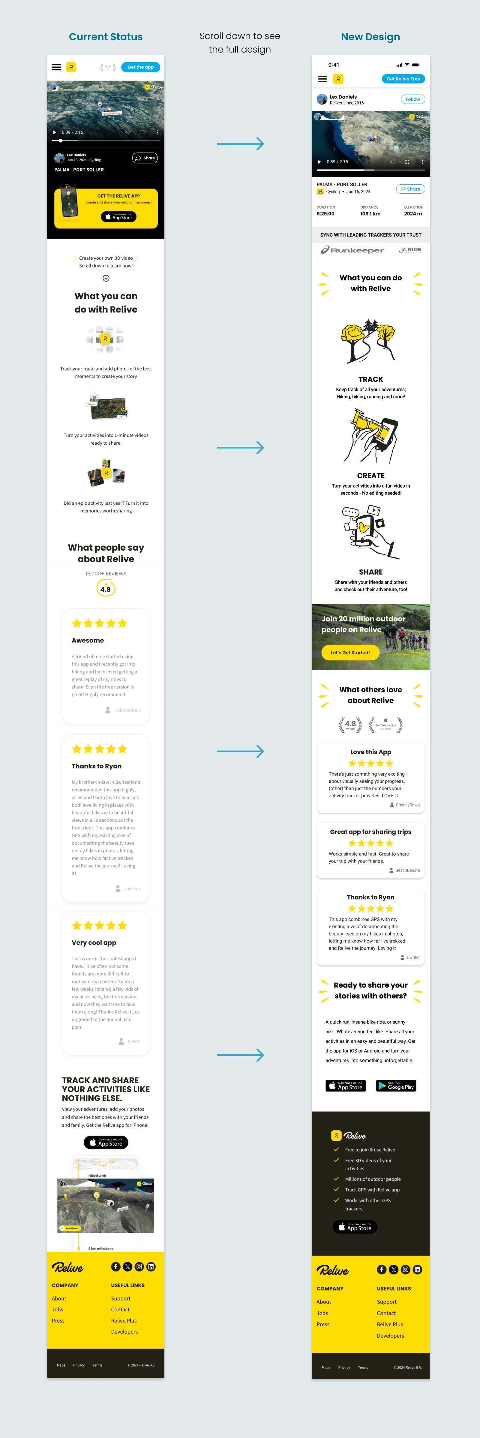
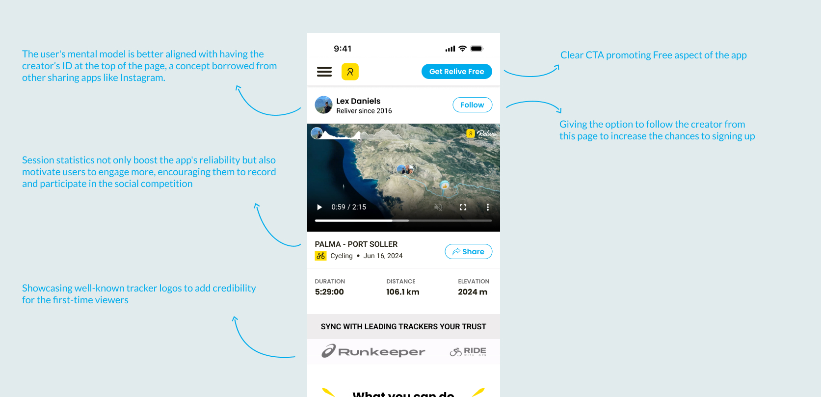
One of the major improvements is in the behavior of the modal. The current modal of Relive had several issues that negatively impacted user experience and conversion:
- 1. Disruptive Timing: The modal appeared too quickly after users landed on the video page, interrupting their viewing experience before they could fully engage with the content.
- 2. Blocking Content: It was a modal that overlaid and blocked the video content entirely, forcing users to interact with it before they could proceed.
- 3. Lack of Context: The modal didn’t provide enough clear value or context to persuade users who were unfamiliar with Relive to take action.
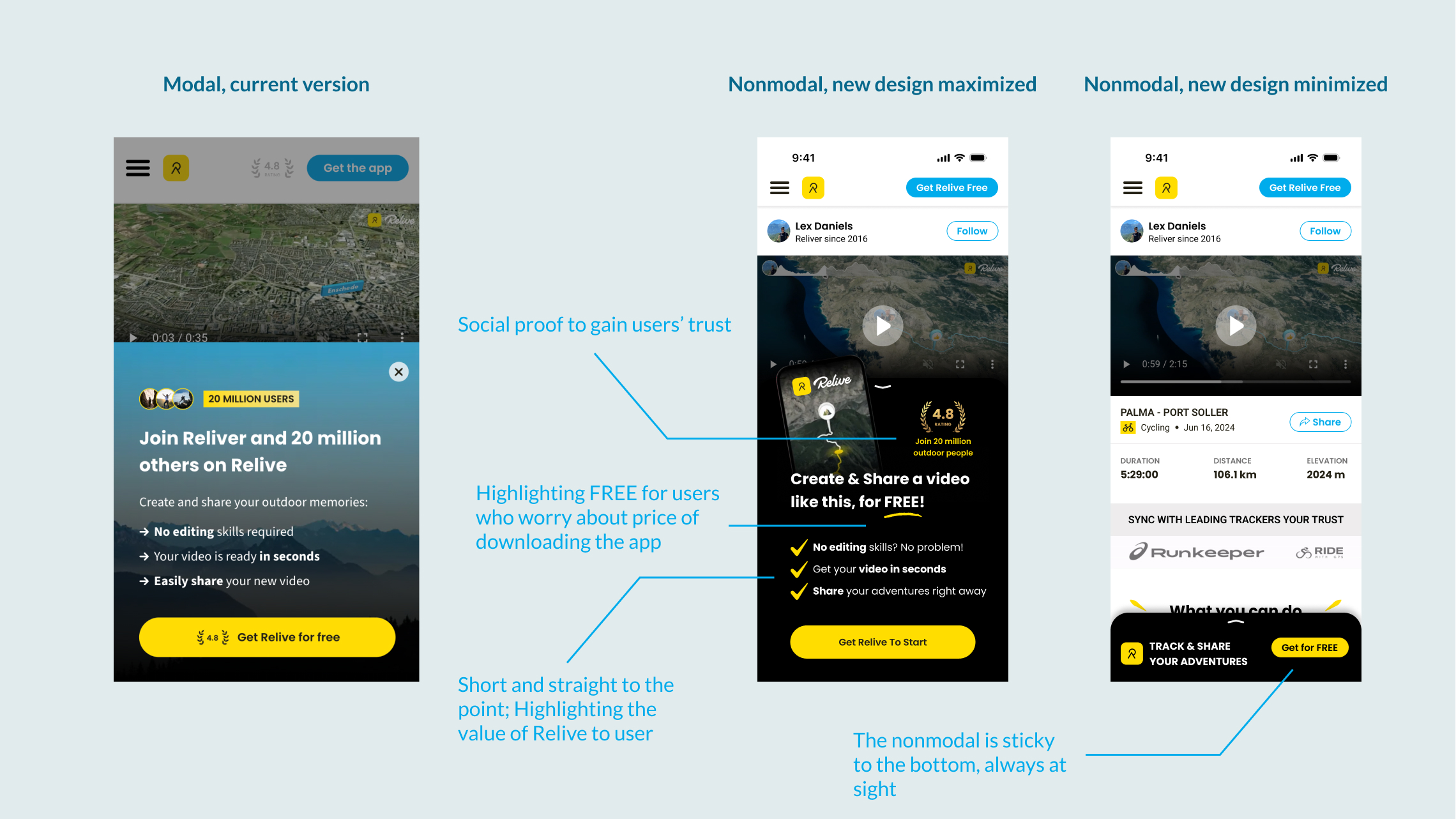
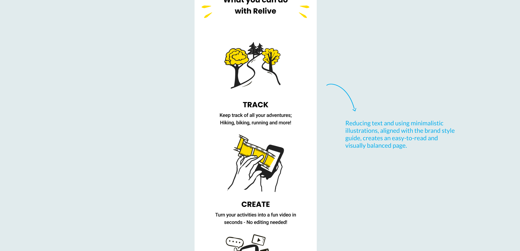
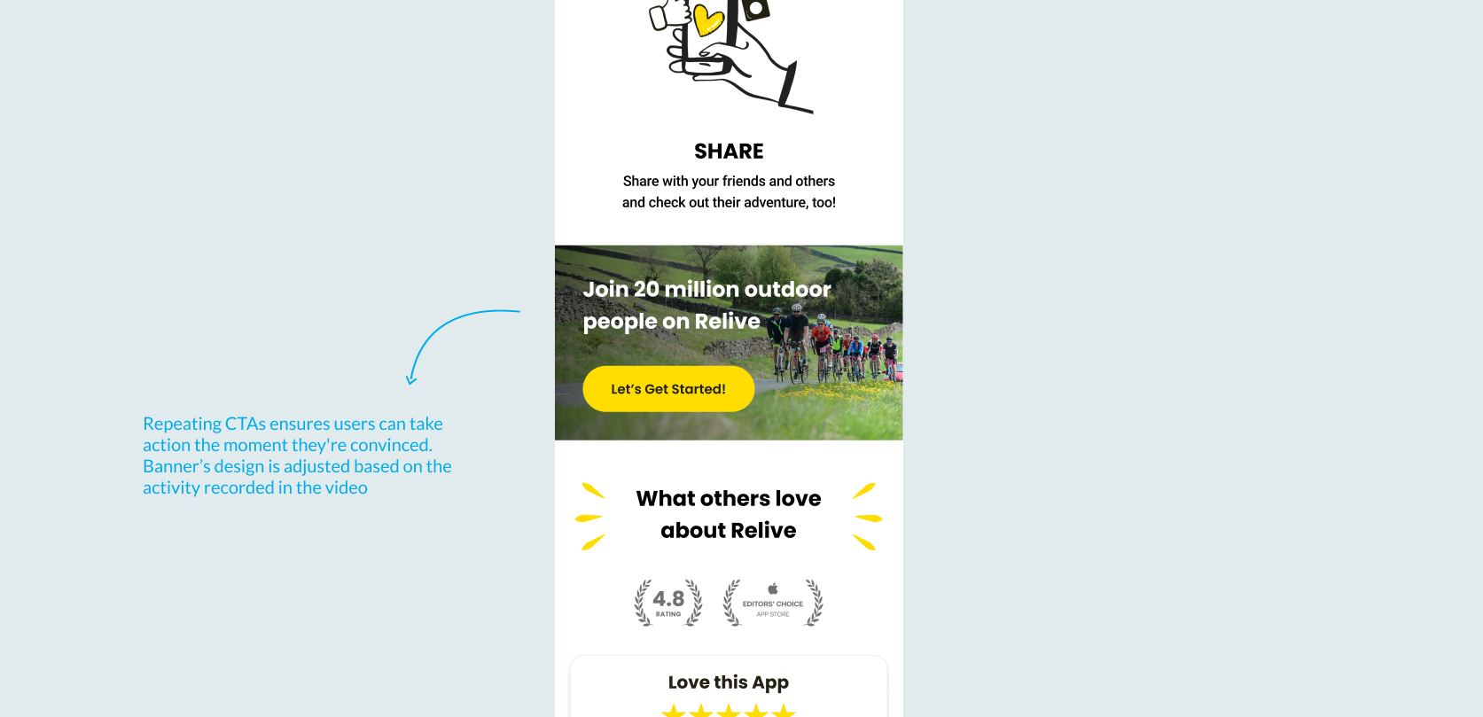
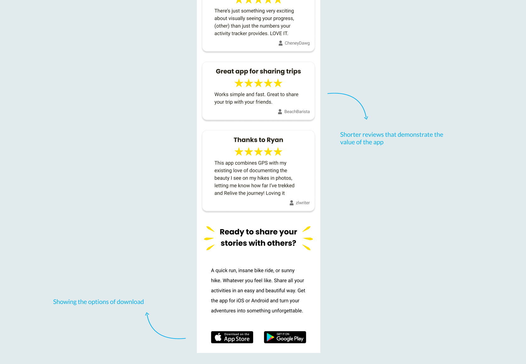
In the new design, the banner has been changed into a nonmodal. Nonmodal to enable users to interact with the page content without the need to close the nonmodal, decreasing the level of frustration in users. The new banner also pop ups after user has watched 10% of the video. This allows user to make informed decision about downloading Relive
Final Look
